ASU Prep Digital
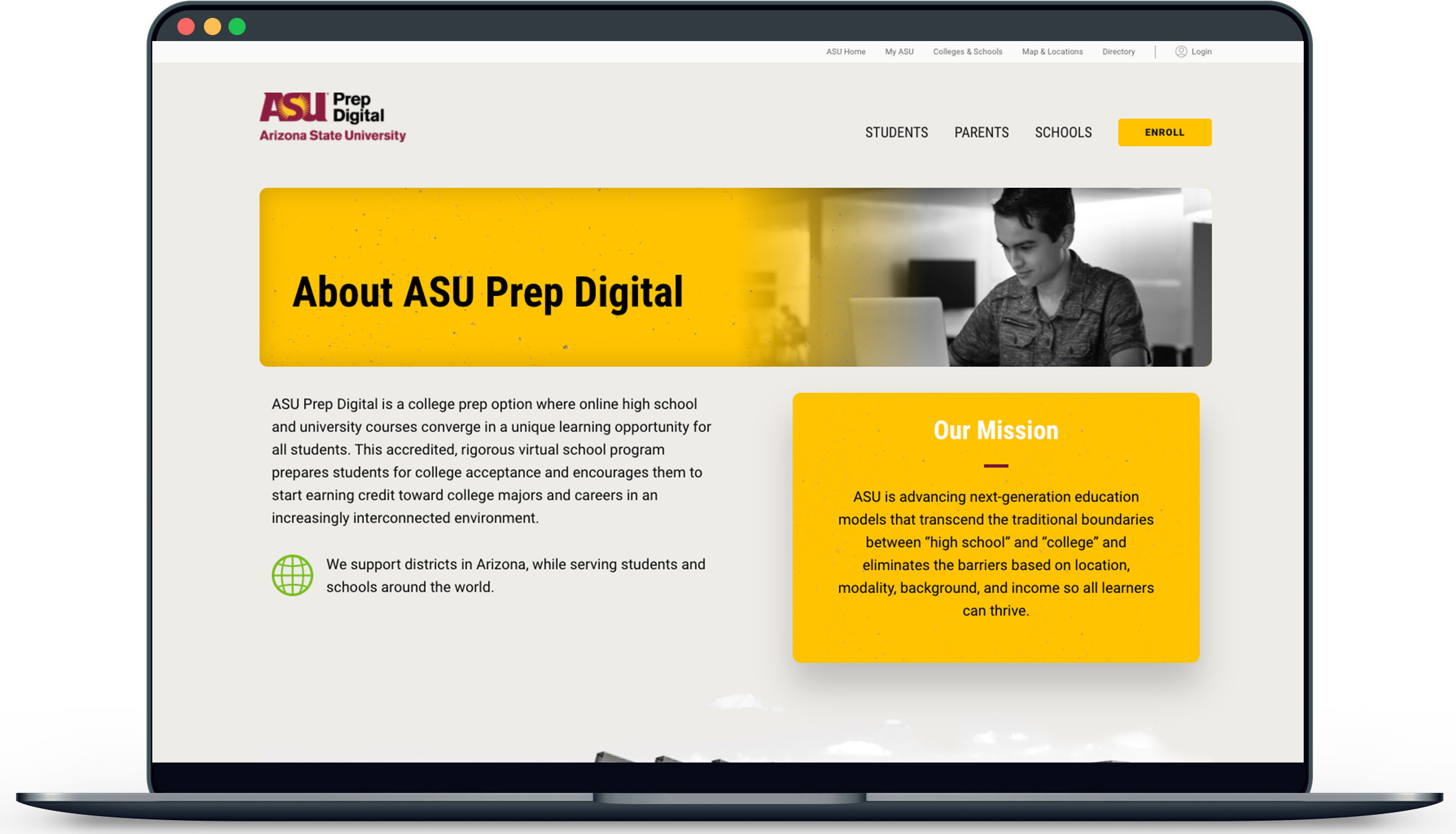
ASU Prep Digital is an accredited online high school where students can take a single online course or enroll in a full-time, diploma-granting program. Because ASU Prep Digital is part of Arizona State University, students can enjoy an accelerated path toward college admission and the chance to earn both high school and university credit.
